
Designing a Component System That Scales Across Client Websites
Across dozens of client projects, I kept solving the same design problems over and over. Every new website started with recreating layouts, reorganizing content, and rebuilding familiar UI patterns before the real design work could even begin.
I created a reusable website component library to change that. Instead of starting from a blank canvas, every project begins with a flexible system of proven components that speeds up discovery, improves collaboration, and creates a more consistent experience without limiting creativity.
Role
Design Systems
Component Design
UX Strategy
Documentation
Used on:
Five client projects across foodservice equipment, healthcare, climbing, and events: an industrial importer of Italian kitchen equipment, a plastic surgery practice, a climbing gym, and two national wellness conferences.
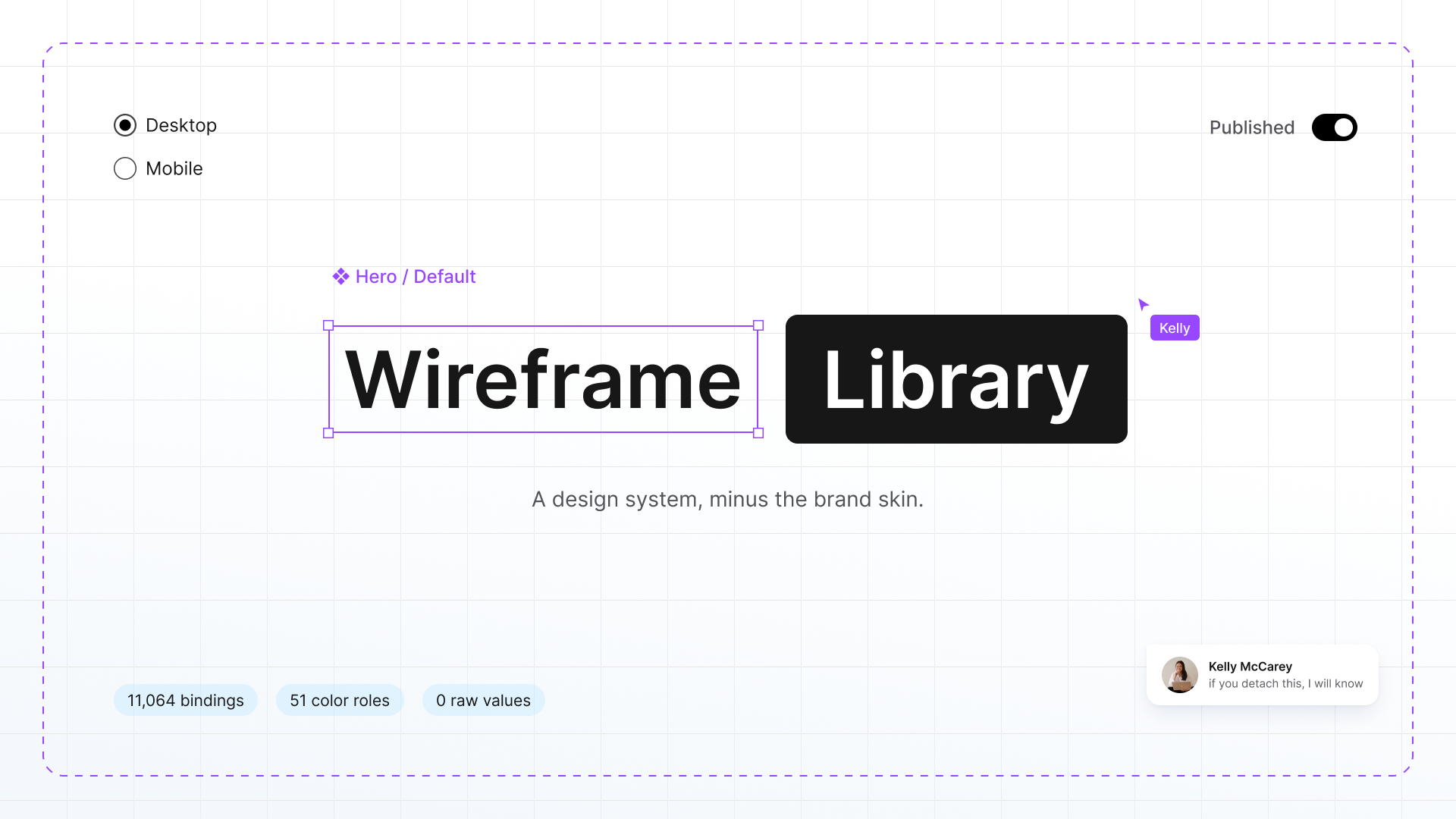
Overview
Every organization has unique goals, audiences, and branding, but the foundation of a great website is surprisingly consistent.
As our team built more custom websites, I noticed we were spending valuable time rebuilding the same layouts, reviewing the same spacing, and refining the same responsive behaviors project after project. Development cycles became longer, not because the websites were unique, but because we were repeatedly solving problems we'd already solved.
To streamline the process, I created a reusable website component library, built in Figma and backed by a shared development framework we refined through real-world builds. Every wireframe component was fully responsive, tested across devices, and refined through real-world development. Instead of treating wireframes as static mockups, they became a production-ready foundation that designers, developers, and stakeholders could all build from.
The result wasn't templated websites. It was a faster, more thoughtful process that allowed every project to spend more time on what actually makes it unique. The information architecture, the user journeys, and the UI and branding.
The goal wasn't to speed up design. It was to eliminate repetitive work so design and development could focus on solving new problems instead of old ones.
Building a Smarter Foundation
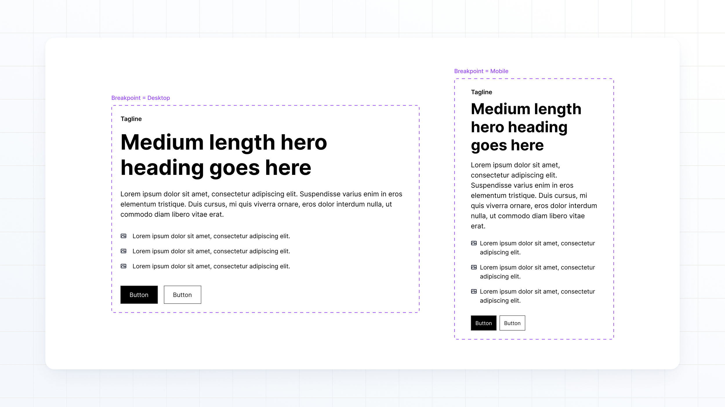
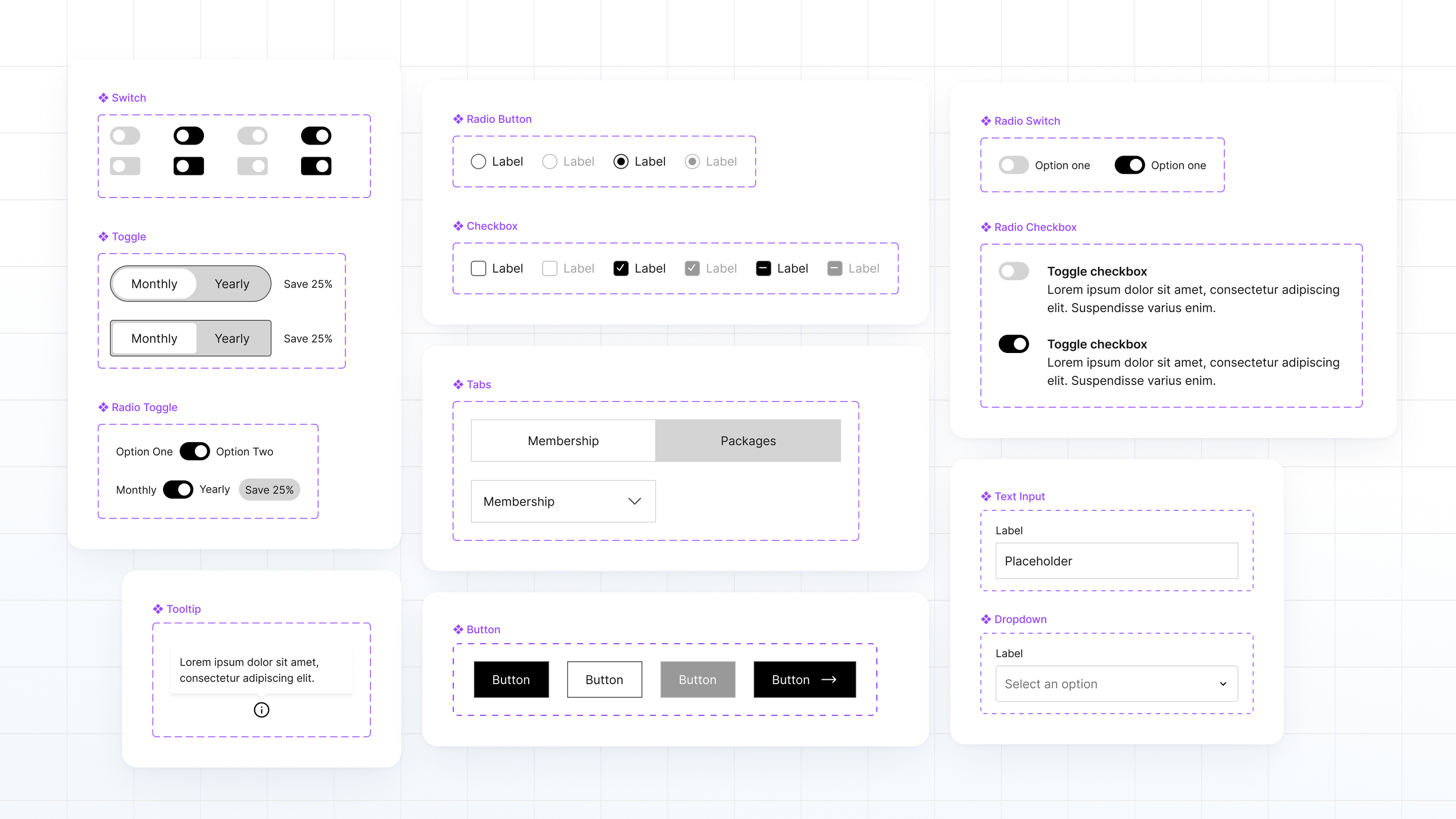
Rather than creating a collection of static wireframes, I identified the layouts and interface patterns that appeared across dozens of projects and turned them into a reusable component library in Figma.
There are plenty of off-the-shelf UI kits out there, but none of them solved the actual problem. They were static visuals styled with someone else's decisions, and disconnected from how my development partners actually build. What I needed was the structural layer of custom marketing websites: storytelling pages, service menus, booking and lead-gen flows, event pages, editorial layouts. Building it from scratch meant the components match the patterns my clients actually need, the tokens speak the same language as our development framework, and every rule in the system is one we chose on purpose. You can't buy that. It has to be grown out of real projects.
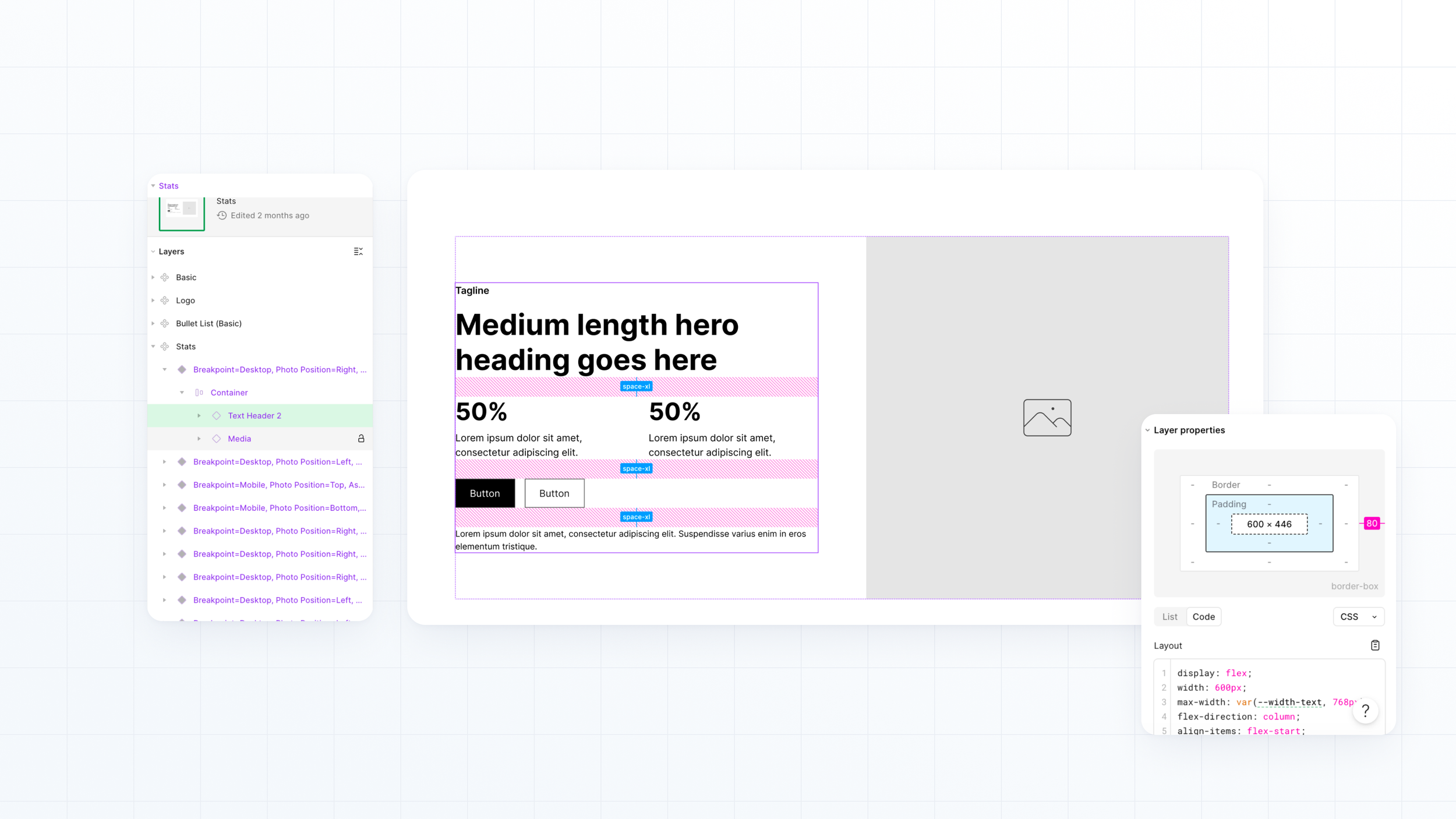
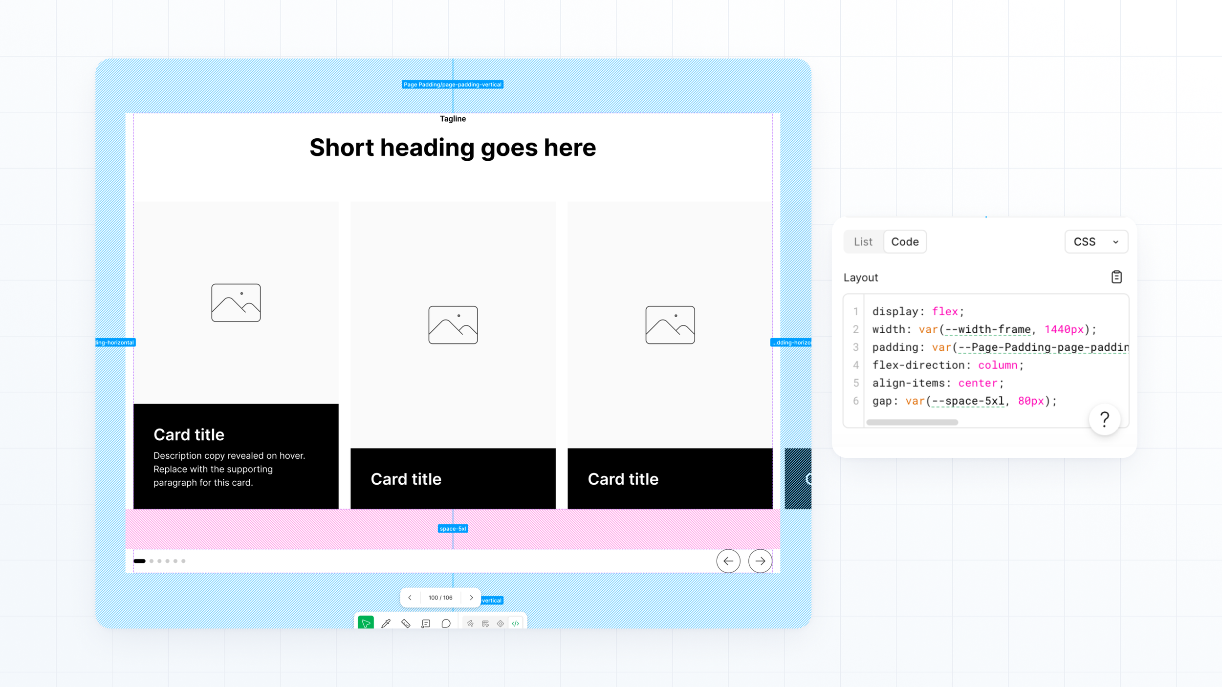
I worked closely with developers to translate that library into a shared development framework. Once the components existed in a real website environment, I could review responsive behavior, refine spacing, typography, and interactions, and make sure each component performed consistently across devices before it became part of a client project.
That collaborative process meant we solved structural problems once instead of solving them over and over again for every website.
Built on Tokens, Not Guesswork
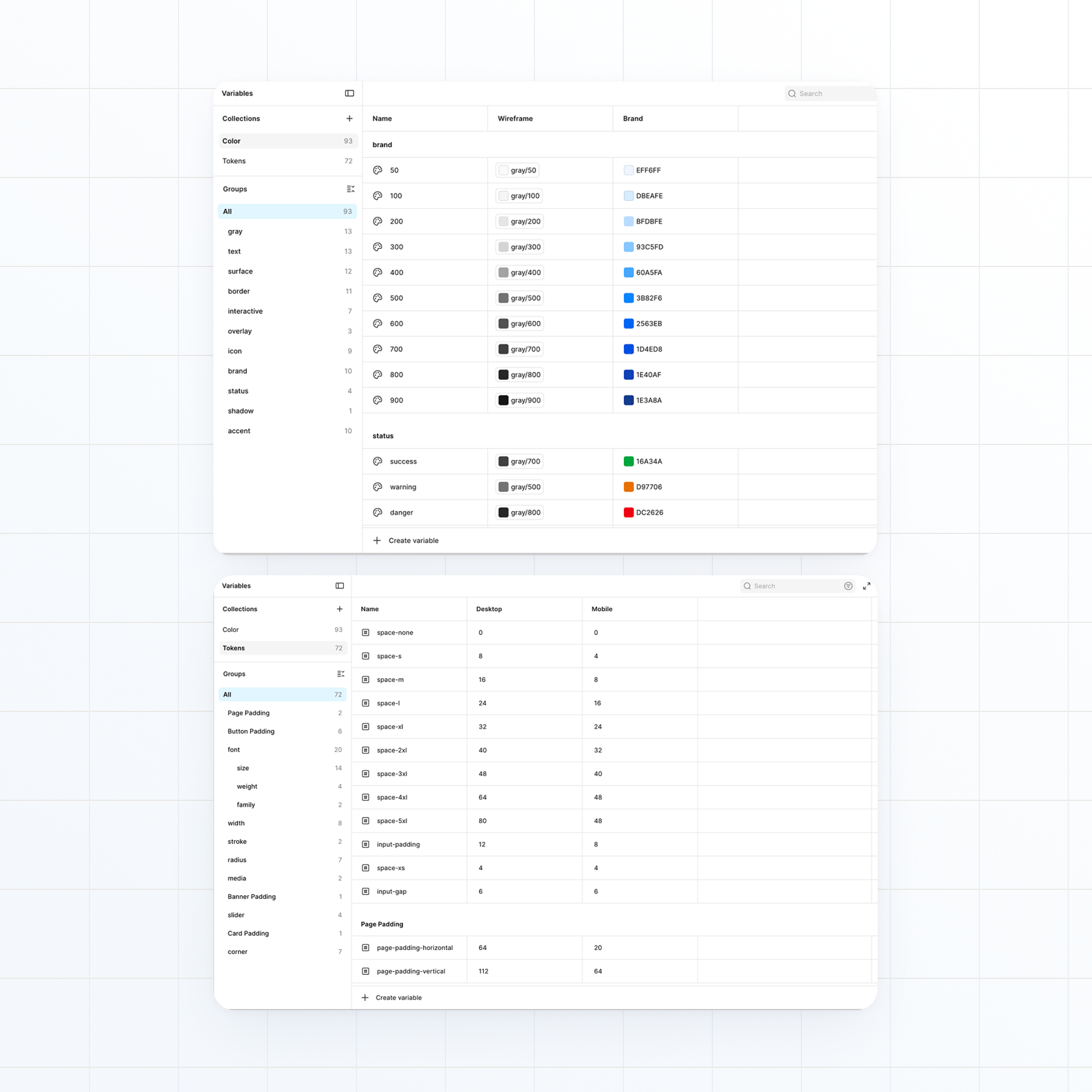
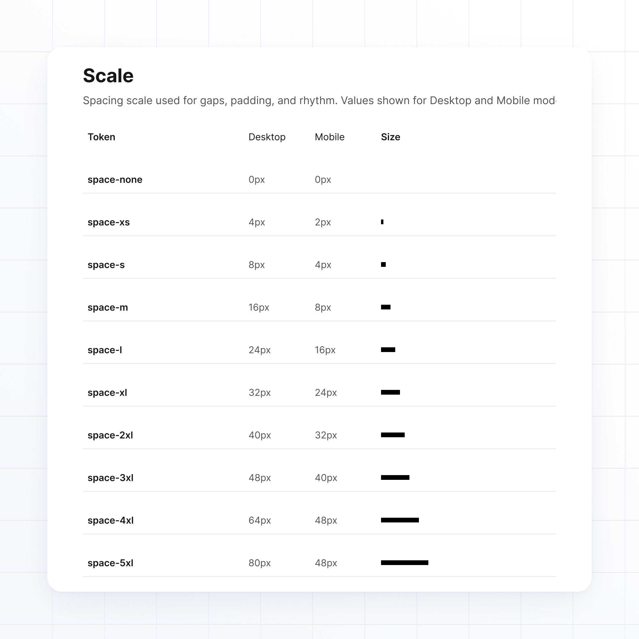
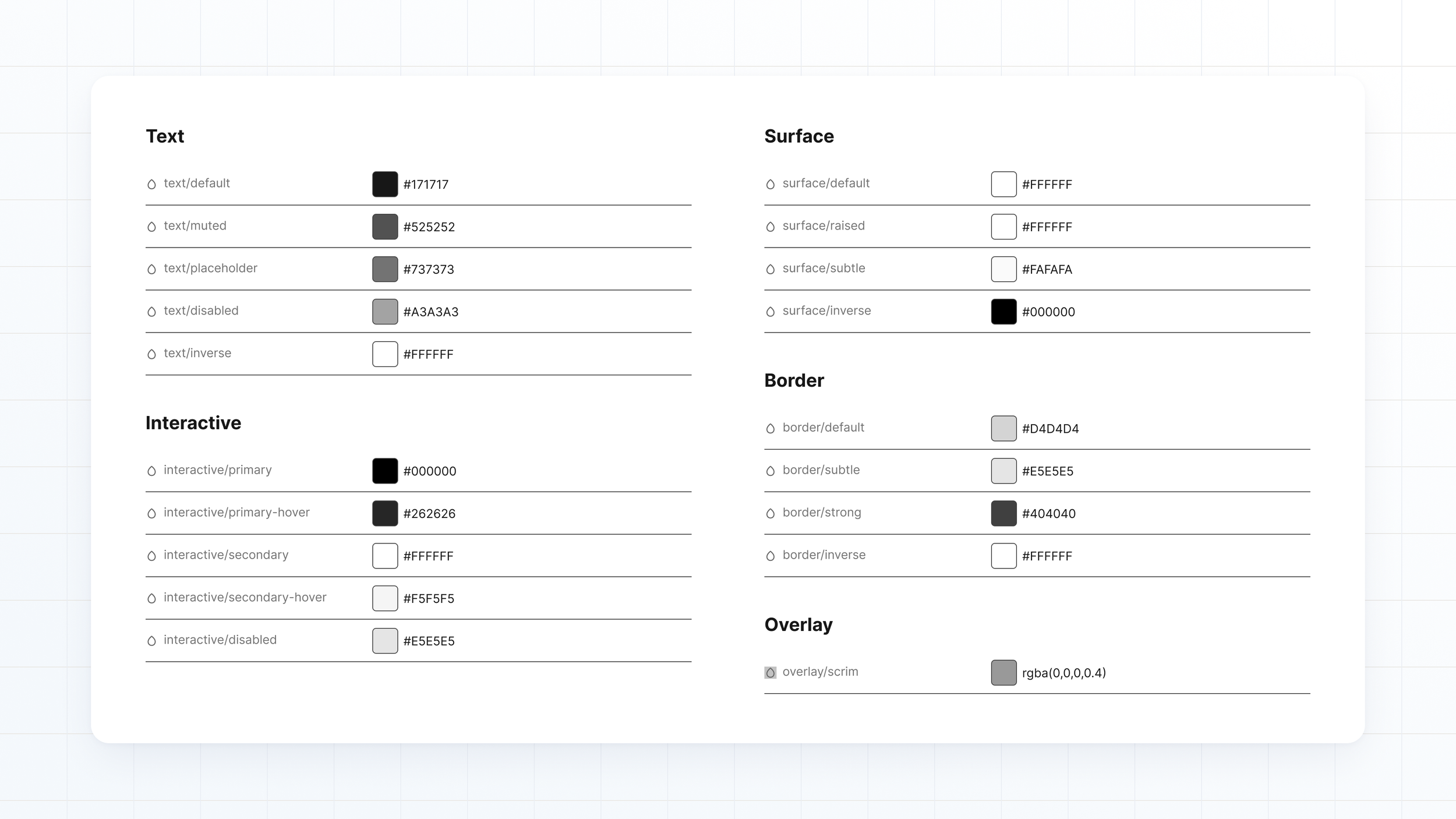
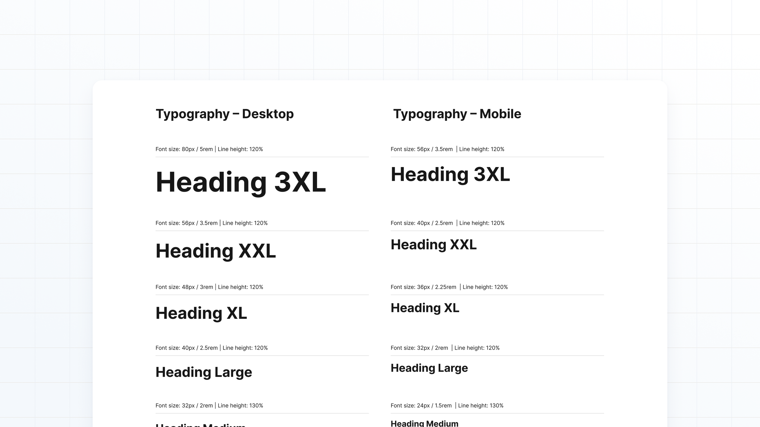
Under the components sits a token architecture that does the heavy lifting. Spacing, type sizes, and padding live as variables with two modes, Desktop and Mobile, so a component adapts to its breakpoint by switching modes instead of being rebuilt. Color works the same way: a small set of primitive values feeds semantic tokens like text/muted, surface/raised, and interactive/primary, and components only ever reference the semantic layer.
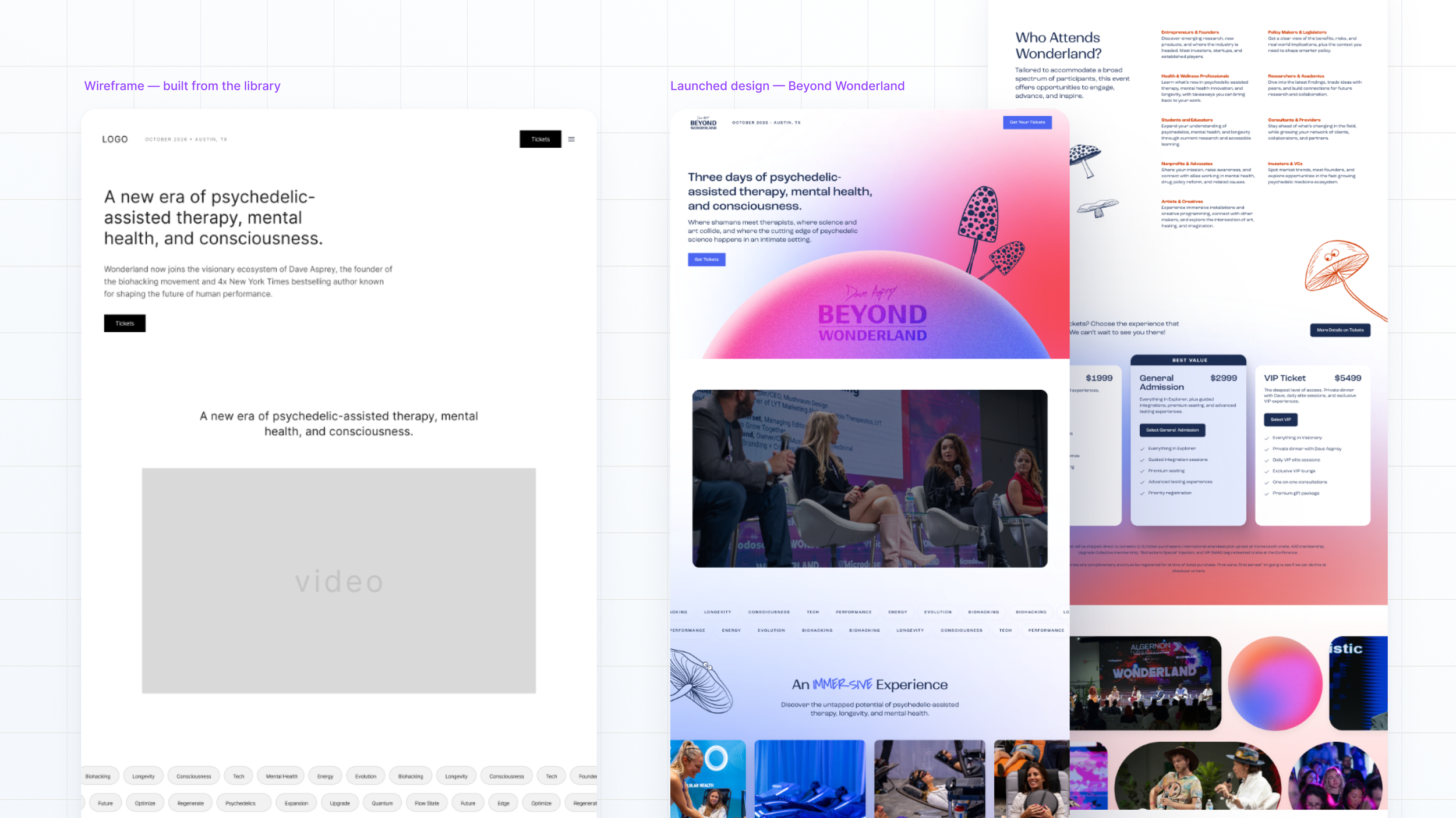
That structure is what makes the system agile. Nothing is styled by hand twice: 56 spacing and type tokens, 32 color variables, and 69 text styles carry every component. It also means the jump from wireframe to branded design is a token swap, not a rebuild. Brand fonts and colors flow into the same variables the wireframes already reference.
A UI kit is a folder of static components that helps designers assemble mockups faster. That isn't what this is. A style guide sets visual rules but doesn't solve consistency in code or process. A pattern library collects reusable pieces but comes with no rules for how to use them, so every project drifts in its own direction.
This is the whole stack working together: components that exist in Figma and in code, tokens that carry the spacing, type, and color decisions, documentation that explains the thinking, and governance that controls how the system grows. New components enter through a written proposal, not a detached one-off. It has everything a design system has except a brand skin, and that's by design: any brand can sit on top of it.
Designing for Development
One of the biggest benefits wasn't during design, it was during development.
Because the component library had been translated into a shared development framework, we weren't rebuilding common layouts from scratch for every project. The core structure, spacing, responsive behavior, and interaction patterns had already been established and refined through previous work.
Instead of spending rounds of revisions perfecting layouts, we could focus our feedback on what actually made each website unique: the brand, visual direction, photography, content, and overall experience.
That shift significantly reduced design-development back-and-forth while making the final product more consistent across projects.
Because the system's conventions are documented, I can use AI tools to pressure test layouts, check new work for drift against the system, and handle repetitive placement, while I stay on the judgment calls. The system holds the quality floor; the tools move faster inside it.
By solving the structural problems once, every future project became faster, more consistent, and easier to build.
In Practice
The library's newest build is a full website for an industrial importer of Italian kitchen equipment: thirteen desktop page wireframes built almost entirely from library components, plus templates for product detail pages, articles, events, and legal pages. Every wireframe reads in the client's voice, drawn from the brand discovery questionnaire, so clients evaluate real content instead of lorem ipsum. Patterns the project needed that didn't exist yet, like a form confirmation state and a cookie consent banner, were made as new components and fed back into the library, so the system left the project stronger than it entered.
Because everything sits on the system, quality is measurable. Every text layer is bound to shared type tokens, and there are zero raw values anywhere in the file. That makes the next step effortless: when the brand layer is ready, fonts and colors flow in through the tokens the wireframes already use.
Outcome
More than anything, the library changed where our time goes. Instead of repeatedly refining layouts and responsive behavior, we focus on what makes each website unique to its client, knowing the underlying system has already been proven. Projects that used to spend their first days rebuilding basic patterns now start with structure, and wireframing a full site takes days, not weeks. Consistency stopped depending on memory. Developer handoff got cleaner because the same-named components, styles, and annotations appear in every file.
And the library keeps compounding. Every project proposes new components, and every new component makes the next project faster.
5
client projects built on the library
80%+
of each wireframe from existing components
11,064
semantic bindings, zero raw values
One shared design language